

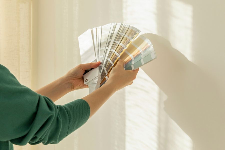
A fresh coat of paint can completely change how a room feels, but choosing the right color isn’t always as simple as picking a favorite shade. Lighting, furniture, flooring, and even the size of the room can affect how a color looks once it covers the walls. A little planning before opening a paint can can save you from an expensive redo. Taking time to compare shades, test samples, and consider the whole space can lead to a choice you’ll enjoy for years.
Start With What’s Already in the Room
Before looking at hundreds of paint chips, take stock of the colors you already have. Flooring, countertops, cabinets, furniture, rugs, and large pieces of artwork can all influence which wall colors will work well. Unless you plan to replace those items, your new paint should complement them rather than compete with them.
Look for colors that appear repeatedly throughout the space. A subtle beige in a rug, soft green in artwork, or warm tone in wood flooring might give you a useful starting point. You don’t have to match anything exactly. Instead, aim for colors that feel connected. Starting with permanent or expensive features can narrow your options and make the finished room feel more intentional instead of looking like the wall color was chosen separately from everything else.
Pay Attention to Undertones
Two paint colors can look almost identical on a sample card but very different once they’re on the wall. Undertones are often responsible. A white might lean slightly yellow, pink, blue, or gray, while a beige could have warm golden tones or cooler gray ones. Those subtle differences can affect how well a color works with the rest of your room.
Compare several similar shades next to your flooring, furniture, and trim before deciding. Looking at colors side by side often makes their undertones easier to spot. Pay particular attention when choosing neutrals because small differences can have a big impact across an entire wall. If a shade suddenly looks pink beside your sofa or green next to your cabinets, another undertone may work better with the materials already in the space.
Consider How Natural Light Changes the Color
Paint doesn’t look exactly the same throughout the day. A room filled with morning sunlight may make a shade appear warmer or brighter, while the same color can look cooler or deeper once the sun moves away. Rooms with limited natural light may also make certain colors appear darker than they did on the paint chip.
Before committing, think about when you use the room most often. A home office used mainly during the day may look very different from a dining room used mostly in the evening. Check potential colors in morning, afternoon, and nighttime lighting whenever possible. Don’t judge a shade based only on how it looks under bright store lights. The way a paint color behaves in your own room matters far more than how appealing it looked on a small card.
Test Paint Samples on More Than One Wall
A tiny swatch can only tell you so much. Once you’ve narrowed your choices, test actual paint samples in the room. Apply each color to a large section of wall or use movable sample boards that you can place around the space. Larger samples make it easier to see how the color works with nearby furniture and finishes.
Try looking at your samples from different parts of the room as well. A shade beside a sunny window may look completely different on a wall across the room. Leave the samples up for several days if you can, and pay attention to which one consistently looks good rather than choosing based on a single moment. Taking extra time during the testing stage is much easier than repainting an entire room after realizing the color feels wrong.
Think About the Mood You Want to Create
Color can influence the overall feeling of a room, so consider what kind of atmosphere you want before choosing a shade. Soft blues, muted greens, warm neutrals, and gentle earthy colors may suit spaces where you want a quieter feeling. Brighter or richer colors can add personality and energy to areas where you entertain or spend time with family.
You don’t have to follow rigid rules about which colors belong in certain rooms. Your own preferences matter more than a decorating trend. Ask yourself how you want to feel when you walk into the space. Calm? Energized? Cozy? Bright? Once you have a general mood in mind, you can eliminate colors that don’t fit it. Choosing based on the experience you want from the room may lead to a more satisfying result than simply picking the most fashionable shade.
Don’t Forget About Trim and Nearby Rooms
Walls aren’t viewed in isolation. Trim, ceilings, doors, cabinetry, and neighboring rooms all affect how a paint color looks. A warm wall color paired with a very cool white trim, for example, may create a stronger contrast than you expected. Consider how all of the painted surfaces will work together before making your final choice.
You should also think about what you’ll see when standing in adjoining rooms. Colors don’t have to match from one space to another, but they often feel more polished when there’s some connection between them. You might repeat a similar undertone, use different shades from the same color family, or carry one neutral throughout several rooms. Planning those transitions can help your home feel cohesive without requiring every wall to be the same color.
Choose a Color You’ll Enjoy Living With
Paint trends can be useful for inspiration, but you’re the one who has to see the color every day. A shade that looks beautiful in someone else’s home may not work with your lighting, furniture, or personal style. Give yourself time to compare options instead of rushing because a certain color is currently popular.
The safest choice isn’t always the plainest one either. If you love a rich green, deep blue, or warm terracotta and it works well in your space, you don’t have to default to beige. Consider the room as a whole, test the color under real conditions, and pay attention to how you feel about it over several days. A thoughtful choice is much more likely to remain appealing long after the paint has dried.